UX (user experience) design has recently become more widely recognized. Many of us have heard the term UX used, but what does it mean? What’s the goal of a UX designer? In this article, we’ll answer these questions, share some history, and discuss how you can get started with UX design.
The Interaction Design Foundation, a pioneer in training UX designers around the world, said that UX design is defined as: “A design process used to create products that have relevant experience for users. This involves brand, design, usability, and function aspects.”
Usability and function are the essential elements of UX Design. UX has a strong relationship with users, technology, and business. In a specific digital product, it’s important that the UX designer understand the limitations of the technologies that are going to use. For example, if you are developing a responsive web project with HTML and Javascript, as a designer you need to understand the basic limitations of the technology. That way, designers avoid creating features that aren’t supported. It doesn’t mean that a UX designer needs to know about code, but they must know the principal characteristics and limitations of each technology.
Also, a designer has to know the business model of the product. Many people think that a UX designer always has to create a beautiful and innovative product, but the reality is that sometimes creating a common design is necessary to achieve the goals of the business.
User Design History
Many theories exist about the beginning of UX Design. Some say that the industrial revolution initiated the first debates about the relationship between a machine and its user.
But actually, Apple was the first company to apply the concept of Human Interaction Design. What does this mean? The understanding of the interaction between humans and any aspects of a technological device. Like computer mouse, keyboard, interface is known as Human Interaction Design. For the beginning of UX design, this is the best starting point.
In fact, in 1995 the engineer Don Norman (a pioneer of this discipline) applied this theory while he was leading a design team at Apple. He began using this concept and calling himself a UX designer. In one of his books The Design of Everyday Things (a must-read for every UX designer). He analyzes the design of all the objects around us. He delves into the concept of design and explains the importance of the communication between an object and its user, and how we should improve it. All of this is related to the digital world with things like apps, websites, software, and more.
How do I get started with UX design?
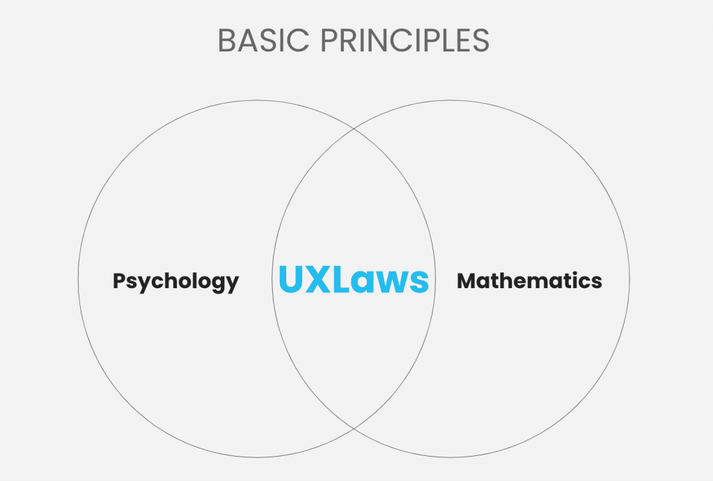
First, you must understand the main principles of design, known as the ‘Laws of design’. Psychology and mathematics backed these laws. The creator, Jon Yablonski, affirms that to have a valid foundation for every UX design, it must apply psychology and math fundamentals to build experiences that adapt to how users perceive and process digital interfaces.
More UX laws
Hick’s Law
“The time it takes to make a decision increases with the number and complexity of choices.”
Hick’s Law is based on a mathematical model that says that the time to make a decision increases as the number of options grows. Very obvious, right?
Specifically, the reality is that when we apply the mathematical model to UX, we’re talking about a fraction of a second between making one decision and another. So, we have to be very careful about the number of options we provide.
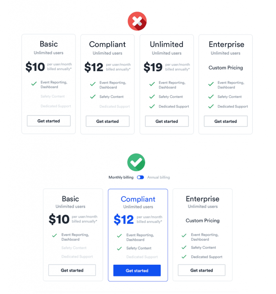
Example: The image on the left looks like a clean UI. However, compared with the image on the right, the number of options could be greatly reduced and could visually help the users to guide themselves. The option in the middle helps the user decide immediately. In any case, reducing the number of options also reduces the time of choosing and, as a result, encourages users to select the most profitable and beneficial option for the business.
It is very important to understand a company’s business model, the design objectives must be aligned with the commercial objectives. In the same way, there must be a connection between the business model and the UX model.
Jacob’s Law
“Users spend most of their time on other sites. This means that users prefer your site to work the same way as all the other sites they already know.”
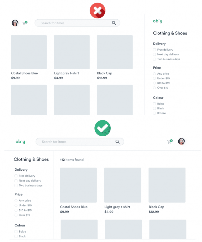
For example, in this sample e-commerce interface, it looks like everything is fine and clean, but the reality is that certain things are messy.
The user has already learned a certain journey from their time on other web sites. You don’t want to make customers think about how your site works. There are certain human behaviors that we unconsciously learn and acquire. Certainly, when someone shows us something outside of what we have already learned, we feel rejection. That is why the design systems promote certain design patterns that we use every day, such as Google, Facebook, Instagram, and more
The goal of UX design is to optimize things. If the user already knows a certain pattern, it must be reused.
Aesthetic Usability Effect
“Users often perceive aesthetically pleasing design as design that’s more usable.”
This law is based on human behavior. As we see, the design on the left is neutral and hierarchies are used well. If we compare it with the second design, we see the application of colors and a much higher level of detail, aesthetically it is perceived more pleasantly. Humans tend to recognize this design as more usable. As a result, a design may be cute but it doesn’t fulfill all the functionalities.
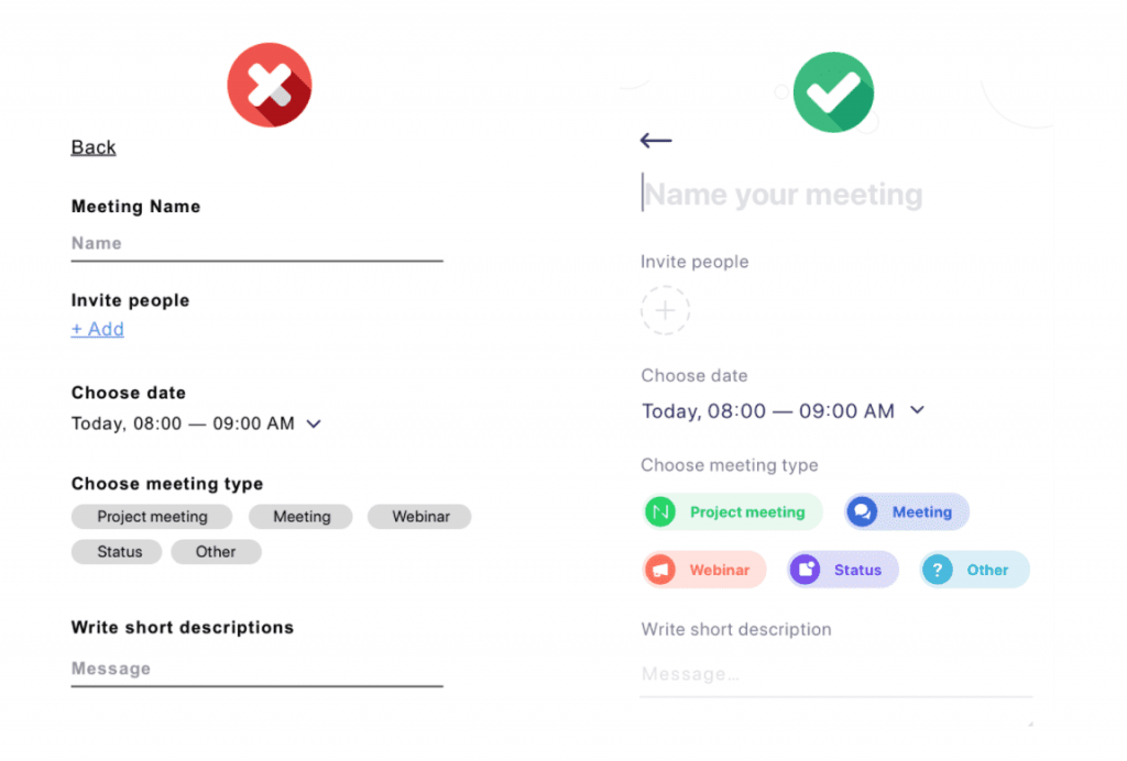
This example highlights the importance of the UI because it helps the user to interact more easily and pleasantly, as a result, the experience improves.
UX has a bit of psychology and mathematics, this helps designers to establish which design is the most appropriate. You don’t only have to care about aesthetics, there are many other things that are a part of good UX design. Also, some mathematical models support these behaviors, so there are specific ways in which certain interfaces and experiences must be developed.
Now we have twenty laws recently added. I’m sure this will increase, you can check out all the laws here.
What is the difference between UX and UI?
UI is inside UX, with UX being the umbrella of everything. The fundamental piece in the UI. Both must be connected although is much easier to understand when they are separated.
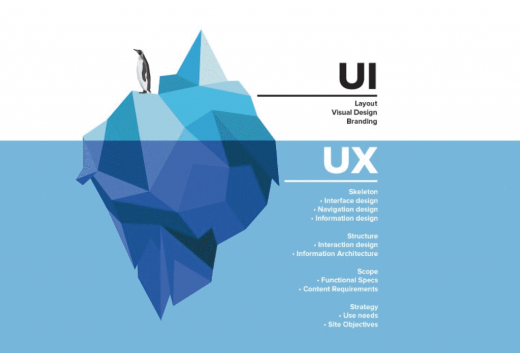
Some differences:
User Interface (what the end-user perceives)
- Branding
- Colors and typography
- Graphics and illustrations
- UI components: buttons, inputs, etc.
- Layout
User Experience (this has to be solid, that’s the only way the UI would be functional and provide a good user experience)
- Definition of the problem and the needs: Detect what the problems and the main needs are. If you don’t understand the problem you will never find a solution.
- Research: Research is done regarding the product, investigate the type of user, and more. It varies for each project.
- Usability test: It’s very important to make usability tests. A designer must know if the product is usable or not. For example it’s important to be aware that the user can finish the process in a particular amount of time. Or certain parts of it will get you frustrated.
- Information architecture: Locate all the content and ideas to generate a hierarchy and order the content. This helps the user to find things much easier.
- User Flow: Design all the flows through which the user passes (this part is very important).
- User Cases: Each person will have a different experience, depending on the use case. Design each experience based on different types of profile
Currently, a designer works with both UX and UI. But if we talk specifically about UX designers, they don’t necessarily have to know how to design. You need to know how to design to be able to transfer all that experience to UI, that’s the only way to have skills that can be used more generally.
Conclusion
Design is everywhere. So it seems simple but it is complex as it evolves through the digital age, making it challenging. Today we have twenty laws and overtime more concepts and insights will appear and this will continue growing. On the positive side, the design principles will always be maintained.
So as designers we have to provide solutions, that is the most important thing.
If you’ve made it this far, thanks for reading! Read more interesting articles here.

